Not all tattoos are made to be aesthetic, but some are just wrong in every sense. Getting a tattoo is something you should plan a bit before doing. Many of these fails are a result of someone not knowing what they wanted. Others, on the other hand, are caused by drunken imaginations or the artist’s mistake. Regardless of the culprit, these tattoos are hilarious.
If there’s such a thing as partly aesthetic…
While some tattoos look so horrible that they make you forget your manners, others are not so ugly, but they make you wonder ‘why?’ This tattoo hangs between the two categories.
Just glancing at the picture, you know we’re talking about the cabbage flower. Although the artist drew the flower well, it shouldn’t have been a tattoo. It looks like something from an elementary student’s textbook.
What else describes this except ‘DIY gone wrong?’
People say this countless times, ‘Not every DIY concept should be tried by everyone.’ Many DIY designs are easier said than done, especially when it comes to the artistic stuff. This tattoo is proof of that- for the person wearing it, at least.
The first thing that comes to mind when you see this tattoo is probably that a kid made the design. But the problem with horrible tattoos done as a kid is that they don’t disappear as you grow older. Total fail.
We didn’t know calligraphy could look this bad!
Not all of us have good handwriting. Why would a tattoo artist be a bad calligrapher? This tattoo will make you ask your tattoo artist to show you samples before calligraphy next time.
While the words are a hit, how it was written is a sure miss. The bad calligraphy makes it look like a DIY tattoo- what’s that dot doing on the capital ‘I’? We think a regular font would have been better.
It wouldn’t be wrong to call this flower a wildflower, would it?
Looking at some tattoo fails, you need nobody to tell you the artist messed it up. This tattoo is one such tattoo artist failure. The artist clearly found drawing a marigold difficult- shouldn’t that be basic?
In plain words, this sorry excuse for a marigold flower is hideous. The leaves are the ugliest part of the flower- they just look like they are dangerous or something. Did we say it looked like a wildflower? Sorry for the insult, darling wildflowers.
This tattoo artist was definitely trying to manage space
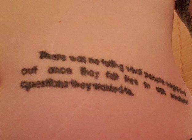
Part of expertise is knowing what a particular task would require. However, it seems like this tattoo artist didn’t envisage how much space the art would take on this person’s stomach. That’s the only possible explanation for this ugly, poorly-written tattoo quote.
The letters are so small and thick that you must squint your eyes to see what was written there. The artist simply made a dreadful mess of the beautiful quote from the book Catch 22. Is it just us, or the words are bent?

